Shroud - Under the shrouds [NEW MAP]
Posted: Wed Nov 12, 2008 2:00 pm
I quickly moved on from my previous map cause of a bag full of ideas. So I present you with this small&fast map.
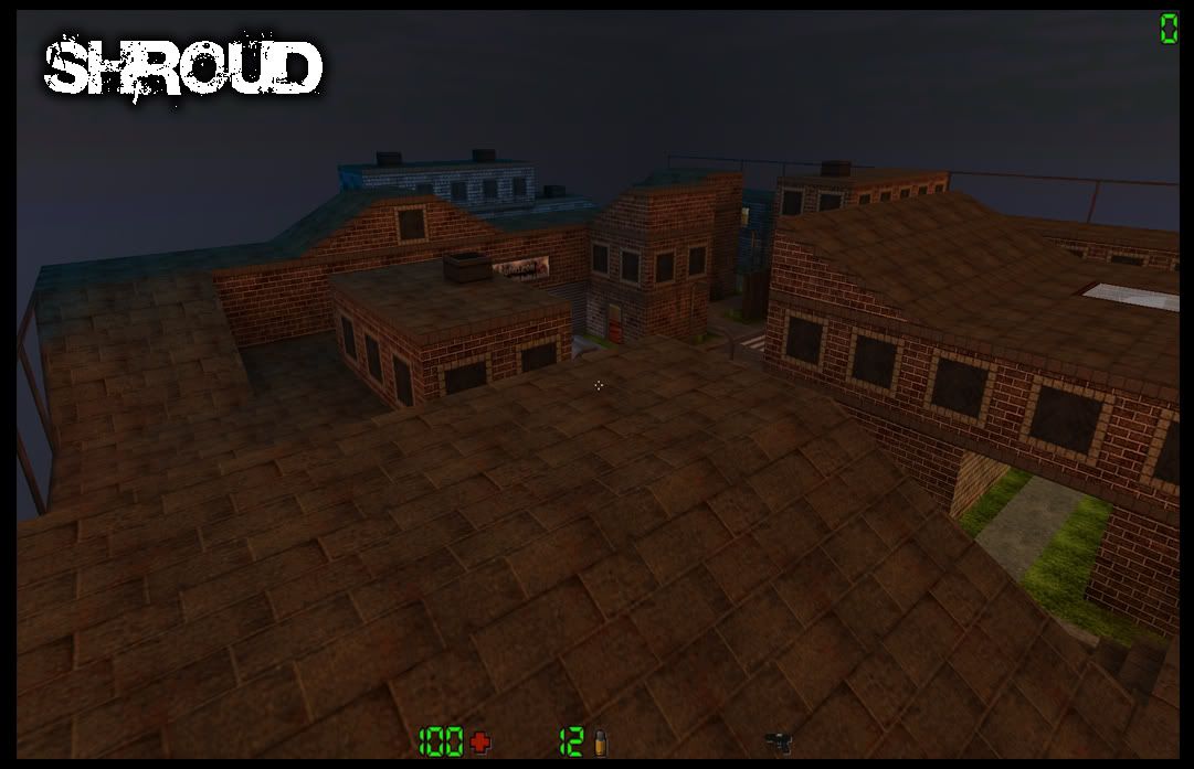
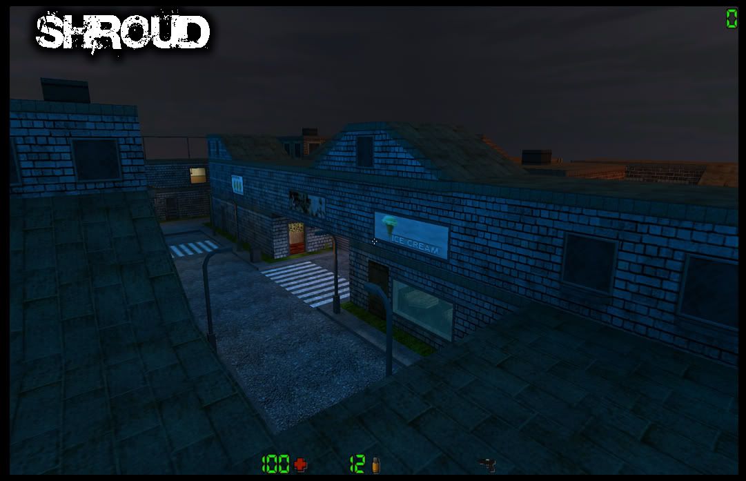
The map is clearly divided, the other part being red and bright and the other being blue and darker >> Representing Day&Night.
So this map differs by another fact:
-The Tunnel leading to the other part of town has an operatable Gate, thus taking tactical planning a step further.
Explained:
-When facing something concidered hard, keep the gate closed to avoid possible fast rounds preventing losses with huge scores.
-When facing something concidered easy, keep the gate open for the same but reversed reason d'oh.
The city has a few shops, making it a bit more realistic than having a bunch of blocks around with no tags or anything.
Theres also some old and familiar posters around the map, since I wanted to have something on it which everybody can recognize.
as for the poster of aeka's(unef0is) quake, it's probably just to remind everybody how greedy you can get, and what an asshole that twat is.

PICTURES:
http://i189.photobucket.com/albums/z185 ... moria1.jpg
http://i189.photobucket.com/albums/z185 ... moria2.jpg
http://i189.photobucket.com/albums/z185 ... moria3.jpg
http://i189.photobucket.com/albums/z185 ... moria4.jpg
http://i189.photobucket.com/albums/z185 ... moria5.jpg
DOWNLOAD: http://www.sakkoliha.org/~futoreqo/aq2/ ... shroud.zip
Thanks to Futoreqo for the upload.
Thanks to FairyB, Gepardi, Tlx, Futoreqo, Skanda, Naukka and the others who i'm apparently forgetting to mention.
Have fun!
The map is clearly divided, the other part being red and bright and the other being blue and darker >> Representing Day&Night.
So this map differs by another fact:
-The Tunnel leading to the other part of town has an operatable Gate, thus taking tactical planning a step further.
Explained:
-When facing something concidered hard, keep the gate closed to avoid possible fast rounds preventing losses with huge scores.
-When facing something concidered easy, keep the gate open for the same but reversed reason d'oh.
The city has a few shops, making it a bit more realistic than having a bunch of blocks around with no tags or anything.
Theres also some old and familiar posters around the map, since I wanted to have something on it which everybody can recognize.
as for the poster of aeka's(unef0is) quake, it's probably just to remind everybody how greedy you can get, and what an asshole that twat is.
PICTURES:
http://i189.photobucket.com/albums/z185 ... moria1.jpg
http://i189.photobucket.com/albums/z185 ... moria2.jpg
http://i189.photobucket.com/albums/z185 ... moria3.jpg
http://i189.photobucket.com/albums/z185 ... moria4.jpg
http://i189.photobucket.com/albums/z185 ... moria5.jpg
DOWNLOAD: http://www.sakkoliha.org/~futoreqo/aq2/ ... shroud.zip
Thanks to Futoreqo for the upload.
Thanks to FairyB, Gepardi, Tlx, Futoreqo, Skanda, Naukka and the others who i'm apparently forgetting to mention.
Have fun!